Joey Weiser is a cartoonist with some really awesome comics under his belt. From his Eisner Award-nominated Mermin series to Ghost Hog, the upcoming The Littlest Fighter (spring 2025, Oni Press) and beyond, he took some time to talk to subhumanzoids about all the inspiration and work that goes into them. Read on for some insight into Joey’s process, how he got published and more!
***
Were there specific comics that inspired you to make your own? When did your interest begin?
I was a big fan of comic strips and superhero comic books growing up, and it was Jeff Smith’s Bone that showed me a melding of the comic strip sensibility and long-form storytelling of comic books that really inspired me to make my own.
I know you’re super into all things tokusatsu and kaiju. What else outside of comics has influenced your work?
Well, I’m a big Japanese film fan in general, and some of that has surely seeped into my work. But the biggest influence I can feel were the TV cartoons of my youth. Rocko’s Modern Life and Eek! the Cat are two that were my real favorites which probably still influence my work. Outside of a few exceptions like The Adventures of Pete & Pete, if it wasn’t animated or didn’t feature creatures of some sort I didn’t have much interest in it.

Are you all digital? What’s your preferred media, and what does your comic making process look like?
I do a lot of sketching digitally and I’ve been doing some small work completely digitally, but largely my work is still drawn on paper with pencil and ink and then colored digitally. I have a whole step-by-step guide to how I make comics online, and it’s a little old but mostly still accurate. The big bullet points are that I do a lot of outlines, move to rough sketches, pencil and ink on paper, and then color digitally.
How did you go about getting your comics in front of people in the beginning?
A combination of making zines and taking them to comic shows, and sharing my work online. At the time, online meant like Livejournal and message boards. I went to my first comic show as a creator while I was in college, shared a table with several classmates, and sold / gave away my comics to whoever would take them. I think in the beginning I put a lot more emphasis on getting my work in front of people’s eyeballs than making money. Unfortunately, I still basically hang on to those morals!
When did the transition from self-publishing to professional publishing happen, and what was the querying/pitching process like for you?
Well, self-publishing for me meant printing out mini-comics at my school’s computer lab and then eventually at copy shops. For graphic novels, I’ve been pretty much working with publishers from the beginning. I drew like half of my first graphic novel, The Ride Home, roughed out the rest of the book, collected that all into big mock-ups, and mailed them out to a handful of publishers. I got a resounding, “No thank you,” from most everybody who bothered to respond, but Adhouse Books agreed. And thankfully Adhouse Books rules, so it worked out.
You’ve done short form and long form comics over the years, including a bunch of graphic novels. Do you have a preference for your storytelling?
The nice thing about short form comics is it’s closer to immediate gratification because you get to share them sooner. I like making short comics, but after years of doing graphic novels, it’s often hard to contain a story idea in 4-24 pages or whatever. Lately I’ve been using those opportunities to lean into gag ideas or just try to convey a feeling.
What’s the hardest part about tackling the bigger projects?
The hardest part about big projects is just how much time it takes. Time when you aren’t sharing your work with more than maybe a few people, time when you feel like you’re not accomplishing anything, and potentially time when you are not receiving a regular intake of income. Writing is also hard for me to estimate how long it will take. Once I get into the mechanics of the art it’s pretty reliable to be like, “It takes me X amount of time to draw a page,” or color a page, or whatever. But writing is a lot more nebulous.
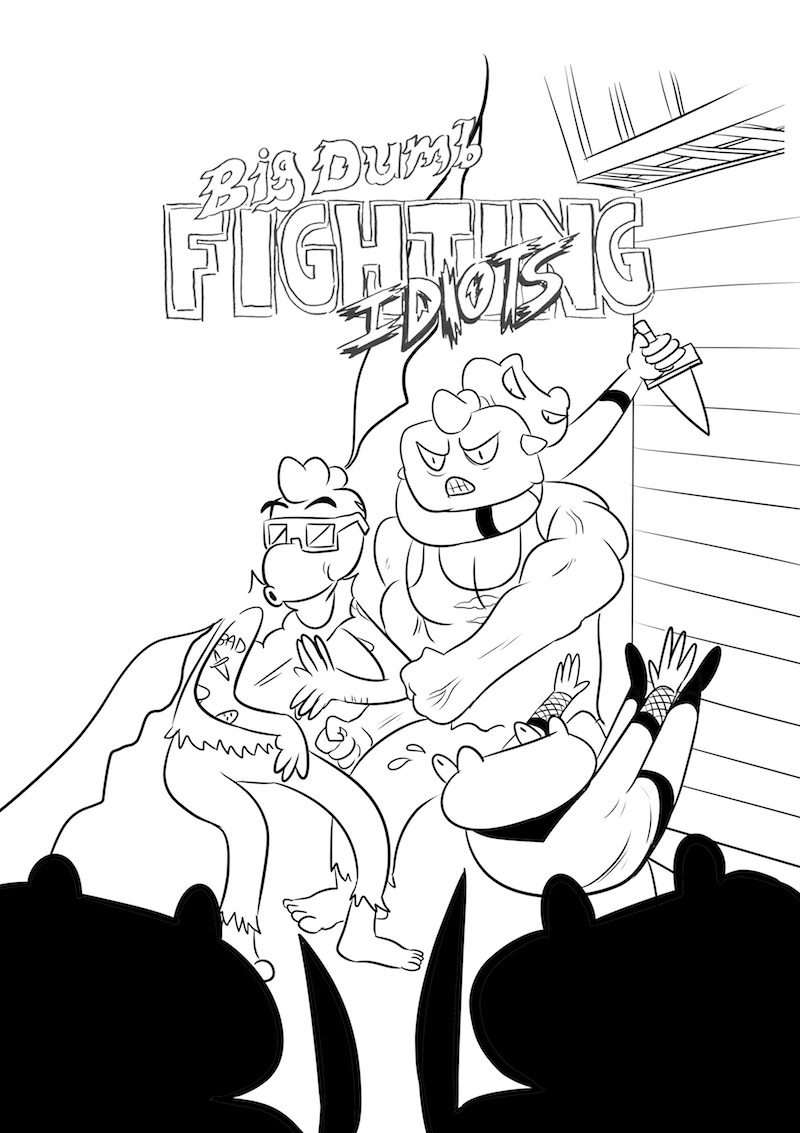
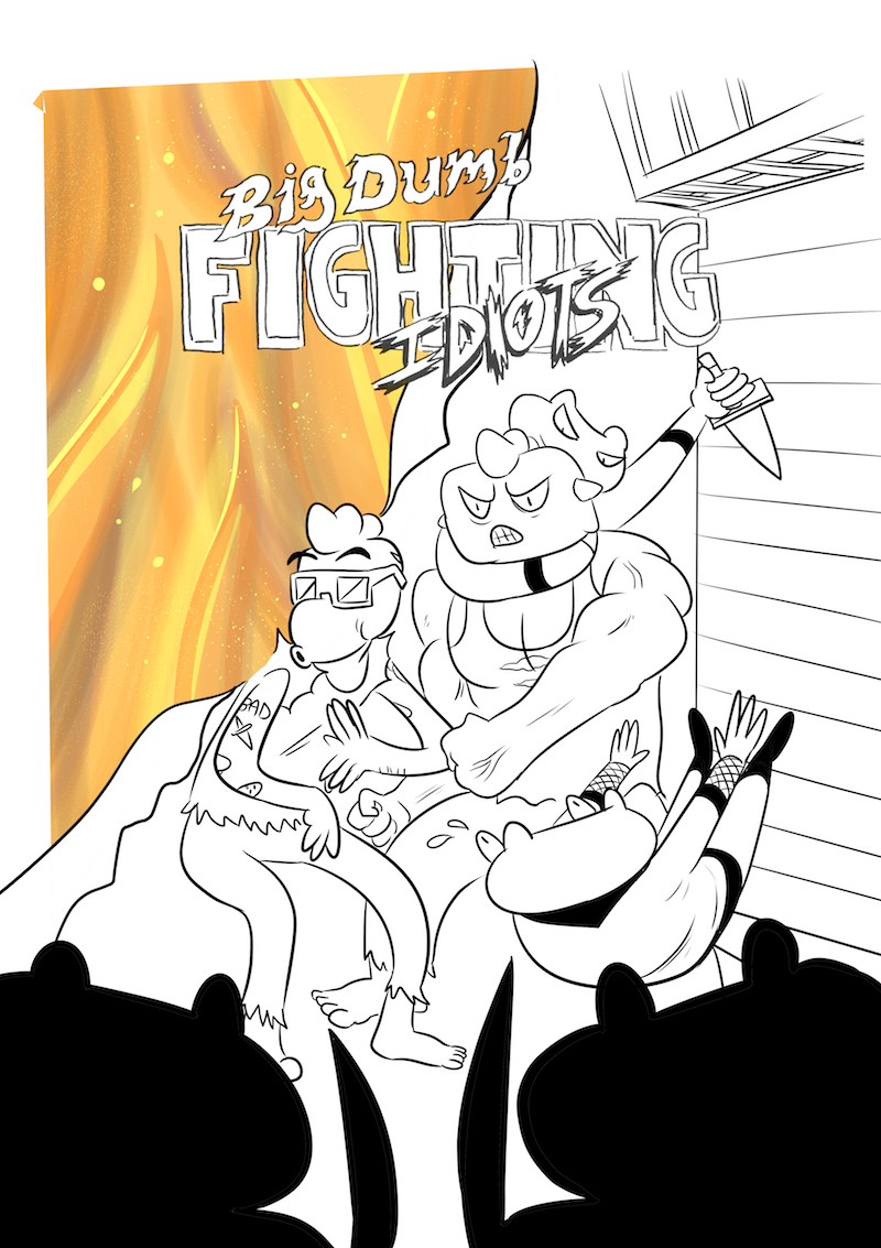
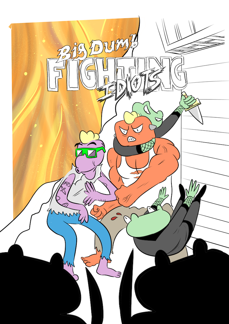
Speaking of graphic novels, you have a new one coming out in Spring 2025. Congrats! How did The Littlest Fighter come to be?
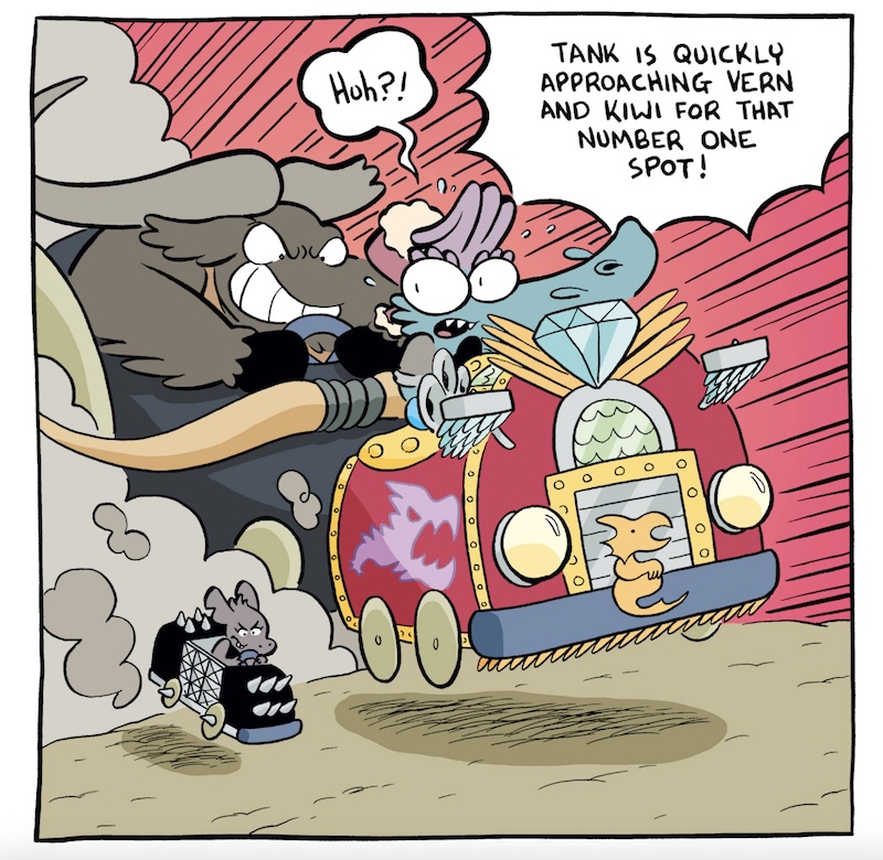
Thank you! Yes, The Littlest Fighter is my new graphic novel, slated for March 2025! It’s essentially about a kaiju who is the size of a human child who wants to battle giant-sized kaiju. This was originally a mini-comic idea I published, obviously inspired by my love of kaiju movies. I tooled around with the idea a bit until it turned into something bigger than the original concept, and brought it to Oni Press who has published the majority of my graphic novels. They liked the idea too, and here we are!
Are there any other projects you’re working on or are you fully honed in on the graphic novel?
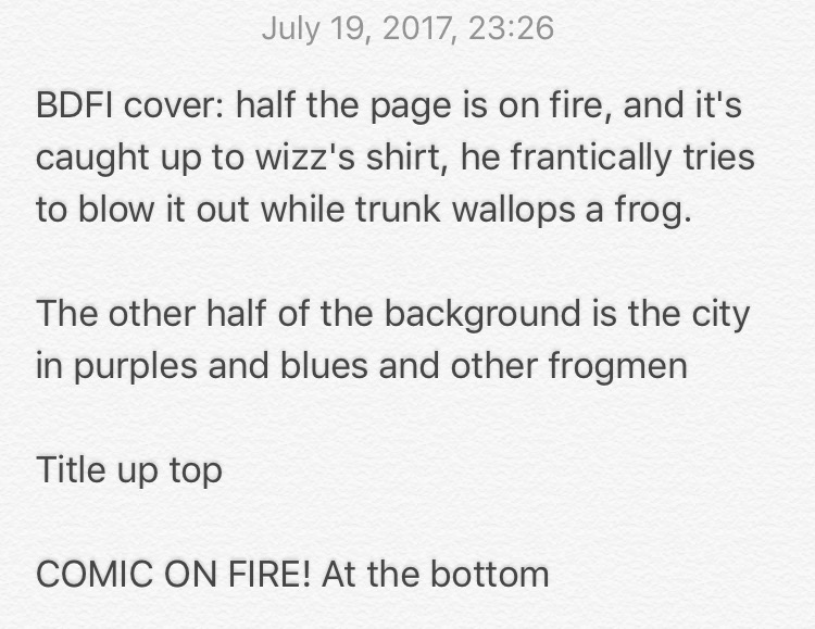
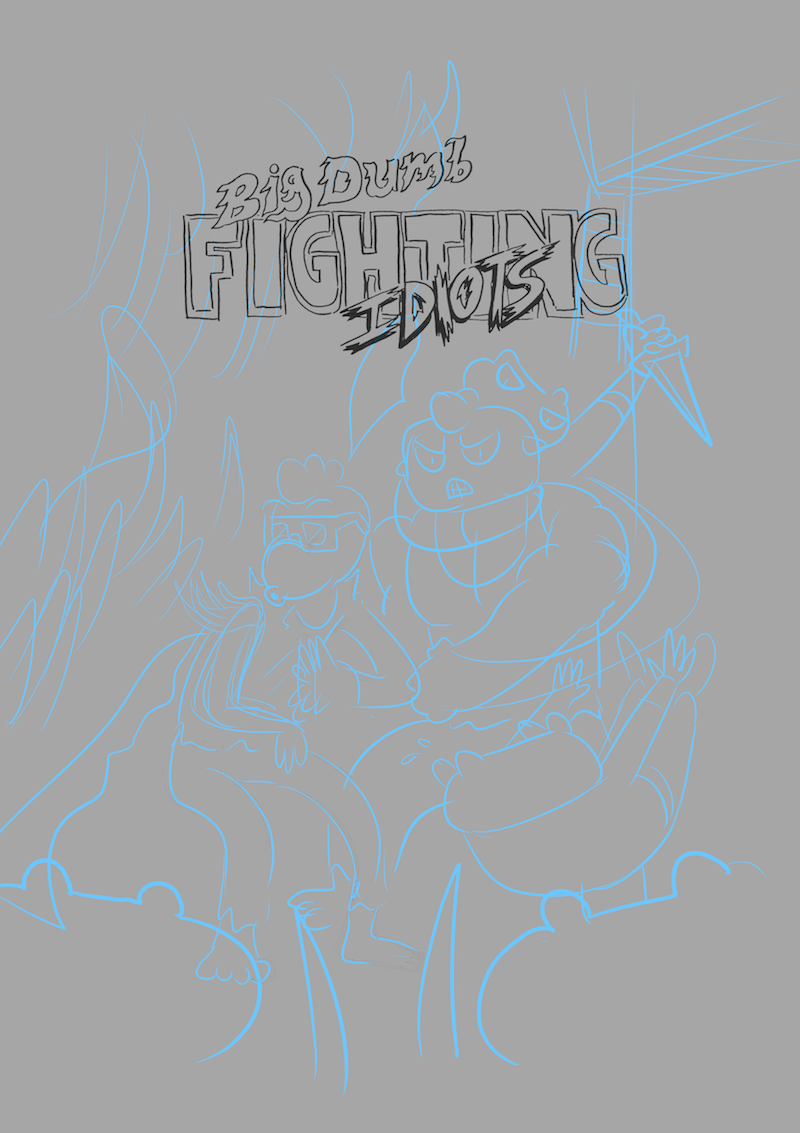
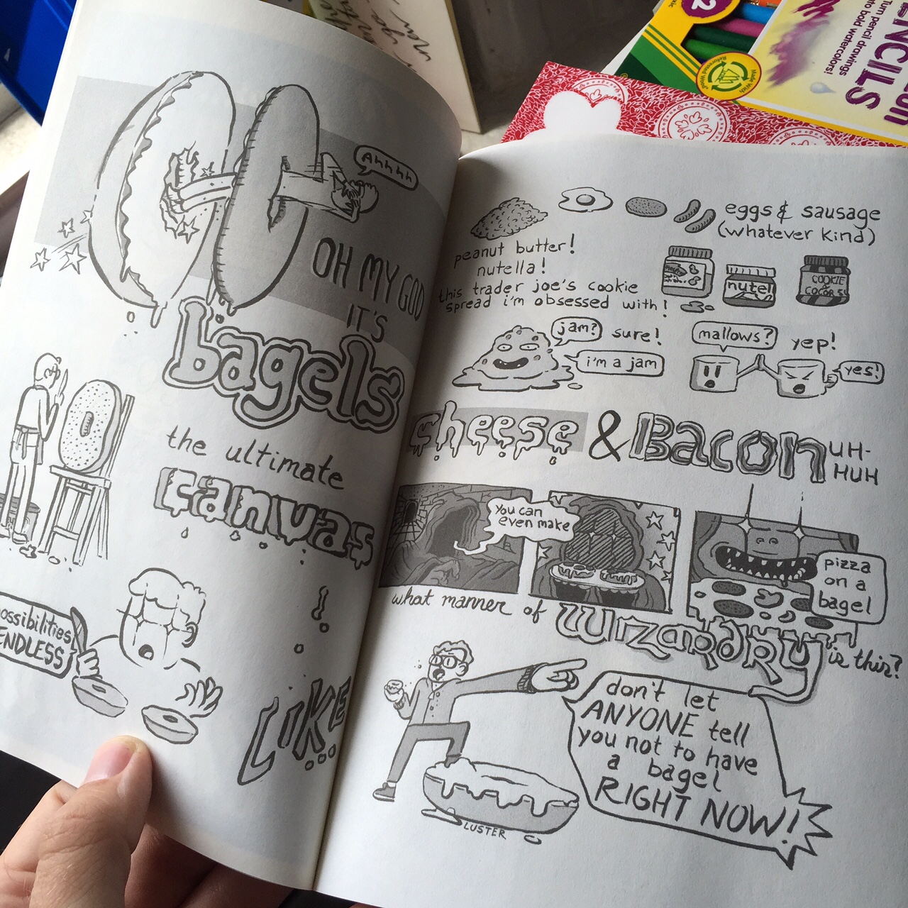
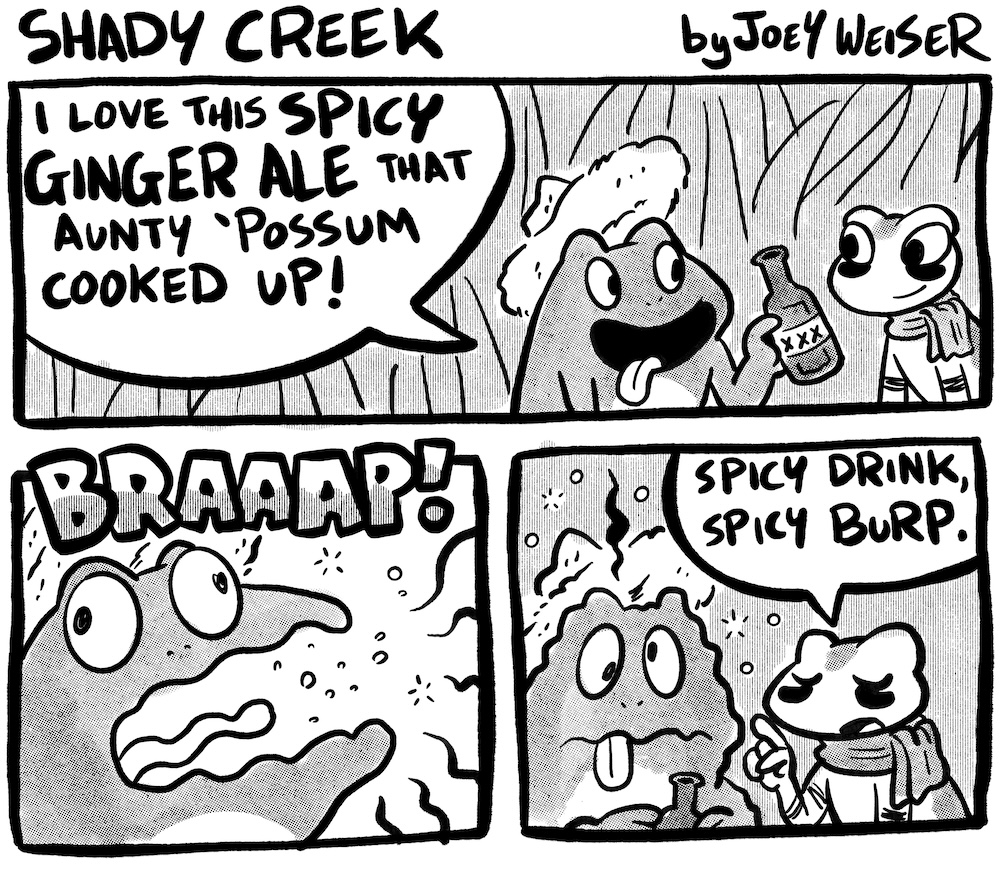
My main comics output lately has been doing a monthly strip called Shady Creek. It’s about frogs (and the plan is to expand into bugs and other creepy crawlies) living together and musing about whatever it is that comic strip characters muse about. It runs in Flagpole Magazine, the local free weekly paper here in Athens, GA but I also post it on social media and archive it on my website.
Lightning round time: favorite Godzilla movie?
Invasion of Astro-Monster!
Sentai?
Gokaiger!
One comic everyone should read?
Hate to repeat myself, but I’ll say Bone!
Most recent manga?
Doraemon!
Can you give everyone an elevator pitch on why they should watch every Tora-San movie ever made?
The Tora-san films are a 50-film series, 48 of which came out over a 25-year span, followed by two anniversary films. They basically feature the same cast in the main roles throughout, and you see not only the actors age in real time, but the world around them change as well. So by the end of it, you feel as if this family is your family, and you’ve watched modern society evolve from the late 60’s into the early 90’s (and then even check in again decades later). It’s a truly remarkable thing. And they’re funny! And romantic! And melancholic! And humane! It’s basically everything I want in fiction that doesn’t feature monsters (although there is a kaiju in one of them).
Thanks so much for taking the time to answer these questions! Do you have any advice for anyone out there looking to get into making their own comics (and hopefully publishing them)?
Write and draw as much as you can, and you almost can’t help but improve. Create the kind of work that you want to make, and put it in front of as many people’s eyeballs as you can. Honestly, how to get published is as much of a mystery to me as it is to you, but if you share it with the people, and they can feel your passion, I think something will come of it.